Charts with Plotly
Note: This tutorial requires enabling Advanced Features. Head here for more information.
Google sheets comes with built in charts, which can get you a simple graph quickly, but with limited customizability.
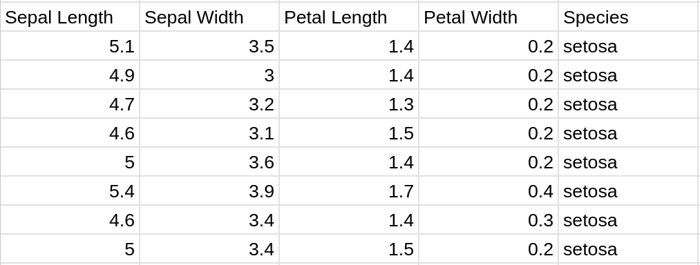
Let's start by looking at the Iris dataset, a popular dataset containing 3 types of irises and their categories. After we've enabled advanced features, we can add the data to our sheet by pulling it as a dataframe from Plotly, and spilling that into A1. Plotly is one of a few popular choices for making visualizations in Python.
import plotly.express as px

def load_data():
    df = px.data.iris()
    A1 = df

# In the REPL run:
# load_data()
The benefit of using the imperative API here is the cells now just contain the values of the data and won't re-evaluate when you open the spreadsheet.
From looking at the data, we see 4 features, and the species identification
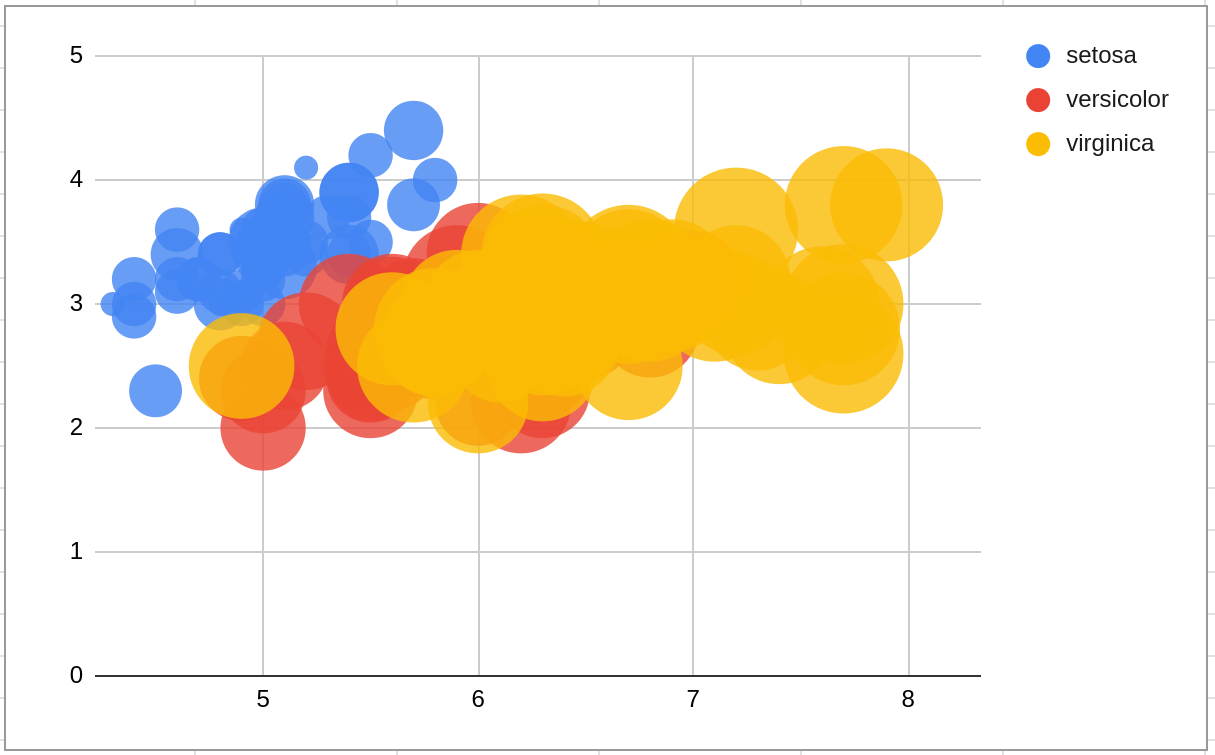
Using the charts native to google sheets, after selecting our data (just sepal length and width columns) and configuring a bubble chart, we get something that looks like below. The x and y axis are sepal length and width respectively and the bubble size is petal width. Unfortunately, this is about the limit of the customizability of the built in bubble chart. While we can show different sized dots, we can't control the min/max size of each. It's also not possible to set the color to be a heatmap based on a numeric feature.
Let's try the same thing, but using Plotly.
import plotly.express as px
import math

def scatter(cells, size_factor=10):
    df = cells.to_dataframe()
    df['Size'] = [
        math.sqrt(l * w) * size_factor
        for l, w in zip(df['Petal Length'], df['Petal Width'])
    ]
    fig = px.scatter(
        df, x='Sepal Length', y='Sepal Width', size='Size', color='Species'
    )

    return fig
The scatter function first loads our data back into a Pandas dataframe, a popular format for working with data in Python. We then add a new size category based on mixing both the petal length and width. This also includes a size scaler which can be used to customize the maximum size of the dots. Finally, we create and return a scatter plot.
You can add the scatter plot to the sheet via:
=PY("scatter", A1:E150, 3)And we end up with a plot that looks like this:

Not a major difference here, but definitely a bit cleaner looking!
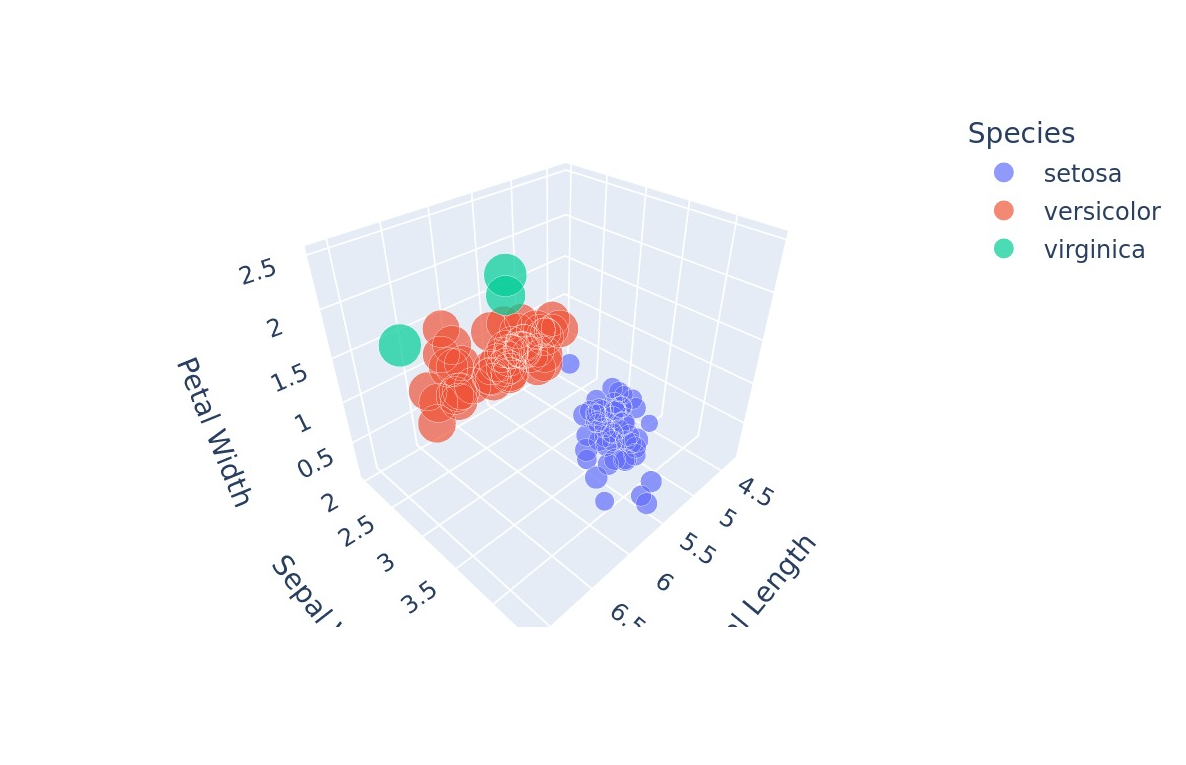
Let's instead try making a 3D scatter plot, a chart type that isn't available in Google Sheets.
import plotly.express as px
import math

def scatter_3d(cells):
    df = cells.to_dataframe()
    df['Size'] = [10 * l for l in df['Petal Length']]
    fig = px.scatter_3d(
        df,
        x='Sepal Length',
        y='Sepal Width',
        z="Petal Width",
        size='Size',
        color='Species',
    )

    return fig
Inserting the code the same way via:
=PY("scatter_3d", A1:E150)We end up with this chart which adds a petal width to the z dimension and uses petal length as the size.
Check out the plotly documentation for more documentation and inspiration. When combining Neptyne and Plotly anything is possible.
Continue to Image Processing with PIL to learn how to leverage a similar process to load and edit images within your sheets!